 IVGraph

An aesthetic Notion page isn’t about decoration. It comes from a few choices made the same way everywhere: one font, two or three colors, one style of icons, a cover that sets the mood and enough empty space. All of it is in Notion’s own settings, on every plan, with no code. Below are fifteen changes, from the two-minute ones to the layout tricks, plus what Notion won’t let you change and how to check the result in dark mode and on a phone.
Work through them on one page you open every day, such as your home page or a reading list. Once it looks right, copy the same choices to the next page. That consistency, more than any single trick, is what makes a workspace look designed.
Before you start: pick a style
Three decisions save a lot of fiddling later:
- A palette. Notion has nine colors besides the default: gray, brown, orange, yellow, green, blue, purple, pink and red, each for text or as a background. Pick two or three. Brown and orange read as warm and calm, gray and blue as clean and minimal, pink and purple as soft and cute.
- A font. Default is a clean sans-serif, Serif feels like a book or a journal, Mono like notes in a terminal. Use one per kind of page.
- An icon style. Colorful emoji, Notion’s simple line icons, or your own images. Mixing all three is what makes a sidebar look messy.
Five combinations that work, if you’d rather start from one:
| Style | Font | Colors | Cover and icons | Widgets |
|---|---|---|---|---|
| Minimal | Default | Gray, blue | No cover or a plain gradient; Notion’s icons in gray | A digital clock; year progress in gray |
| Cozy | Serif | Brown, orange | A warm photo or gradient; emoji such as 🍂 and ☕ | Habit tracker in orange, countdown in brown |
| Dark academia | Serif | Brown, gray, in dark mode | A library or paper texture; line icons | A flip clock; a reading progress bar in brown |
| Pastel | Default | Pink, purple, yellow | A pastel gradient; emoji or your own stickers | Habit tracker in pink, calendar in purple |
| Study | Mono | Gray, green | A dark texture or no cover; simple icons | Pomodoro timer in green, countdown to the exam |
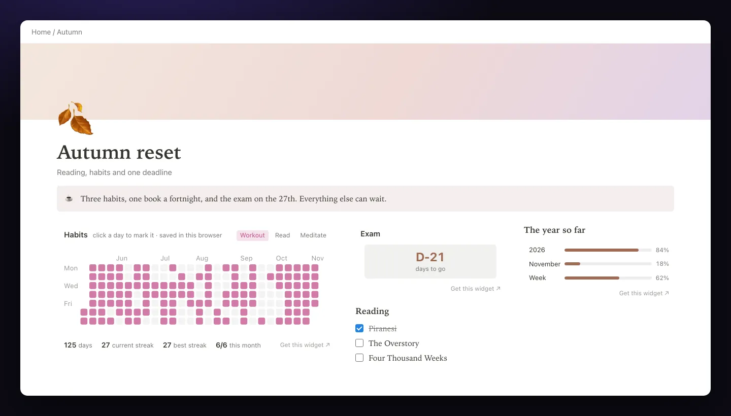
The page below is the cozy one with pink in place of orange: Serif, a warm gradient cover, a brown callout, and widgets in pink and brown.
15 ways to make Notion aesthetic
1. Set the font, text size and width
Click ••• at the top right of the page and open Appearance & layout. Pick Default, Serif or Mono: the whole page switches, headings included. Small text shrinks everything a little, which suits dense pages and dashboards. Full width removes the side margins: use it for dashboards and wide tables, and keep reading pages narrow, since long lines are harder to read.
2. Add a cover that sets the mood
Hover over the top of the page, click Add cover, then Change cover. You can pick from Notion’s gallery, search Unsplash, upload an image or paste a link. Notion recommends images at least 1,500 pixels wide. The cover is cropped differently on every screen width, so keep the important part in the middle band, and use Reposition to move it. Soft gradients, textures and photos with lots of sky are the safest; busy images compete with the page.
3. Choose icons in one style
Click Add icon above the title, or the current icon. The Emoji tab has the full emoji set, the Icon tab has Notion’s own simple icons, and Upload takes your image; Notion recommends 280 by 280 pixels. An uploaded icon can also go into your workspace’s emoji library, so it works as a reaction or inline, where you type : and its name. Icons show up in the sidebar, links and search, so one consistent style tidies up the whole workspace.
4. Color text and blocks with a fixed palette
Select text and open the A menu to change its color or background. To color a whole block, type / followed by the color, such as /brown, or press Cmd/Ctrl + / and type the color name. Cmd/Ctrl + Shift + H applies the last color you used, which makes styling a long page quick.
Decide what each color means and stick to it: one color for headings or labels, one background for callouts, one for warnings. Two or three colors on a page look intentional; nine look like a highlighter accident.
5. Turn callouts into cards
Type /callout to add a box with an icon. Through its ⋮⋮ handle, choose Color and pick a background; Default gives a white box with a light gray outline. Click the icon to change it, upload your own or remove it. A callout can hold other blocks, such as headings, lists and images, so it works as a card: a short note at the top of a page, a quote, or a box of links. Callouts also fit into columns, which gives you a row of cards.
6. Lay out the page in columns
Drag a block by ⋮⋮ next to another one until a blue vertical guide appears, then drop it. Drag the gray guide between columns to set their widths. Notion has no text alignment buttons, but columns cover that too: drag an empty line into a column next to your text to push the text right or to the middle. Remember that a phone shows columns one under another.
7. Use headings and dividers for rhythm
Headings give a page structure you can see at a glance. Notion 3.4 added a fourth level, H4, for small labels. Any heading can be a toggle heading that opens and closes. Type --- for a divider between sections, and leave an empty line before a heading so sections breathe. A short subtitle in gray under the page title, like a line of a magazine, is an easy upgrade.
8. Hide clutter in toggles and tabs
Most pages look better with less on screen. Put long lists, archives and reference notes into toggles, so only their titles show. Notion 3.4 also added a tabs block that splits content into clickable sections, such as This week, Next week and Someday, in the space of one.
9. Add a table of contents to long pages
Type /table of contents for a block that lists the page’s headings as links. Appearance & layout also has a Table of contents option for the page. On a long guide or a wiki page, it saves scrolling and makes the structure visible.
10. Show databases as galleries with covers
Tables are rarely pretty. Switch a database of books, recipes, trips or projects to a gallery view and set Card preview to the page cover or to a files property with an image. Choose a card size, turn on Fit image if covers get cropped, and hide properties you don’t need on the cards. A reading list with book covers is the classic example.
11. Color boards and select options
In a board view, turn on Color columns in the layout settings, so each group gets the color of its status. Give select and status options colors from your palette, the same color for the same meaning everywhere. In tables, hide properties you never read, turn on wrapping for long text and keep the columns you show to the few that matter.
12. Use images and GIFs sparingly
One image can set the tone of a page: a photo strip under the title, a mood board in columns, an illustration in a callout. GIFs move all the time, which distracts while you work, and large ones slow the page down. One small GIF per page is plenty. Keep uploads under 5 MB on the Free plan.
13. Add a quote
Type /quote for a block with a bar on its left. A line from a book you love, a goal for the year or a reminder to yourself under the page title gives a personal touch without clutter.
14. Add widgets in the same colors
Widgets bring what Notion can’t: a clock, a calendar, a countdown, a habit heatmap, year progress. They’re small web pages you add with /embed, and the free ones on our Notion widgets page are made to blend in:
- Your palette. Each widget takes an accent in one of the same nine colors Notion uses for text, from gray to red. Set the habit tracker to pink and the countdown to brown, and they match the callout next to them.
- No background of their own. With no theme set, a widget is transparent and follows the light or dark mode of the device, as Notion does, so it sits on the page instead of in a white box.
- Styles to pick from. The clock comes digital, analog or flip, the countdown can show just “D-21”, and year progress shows bars or dots.
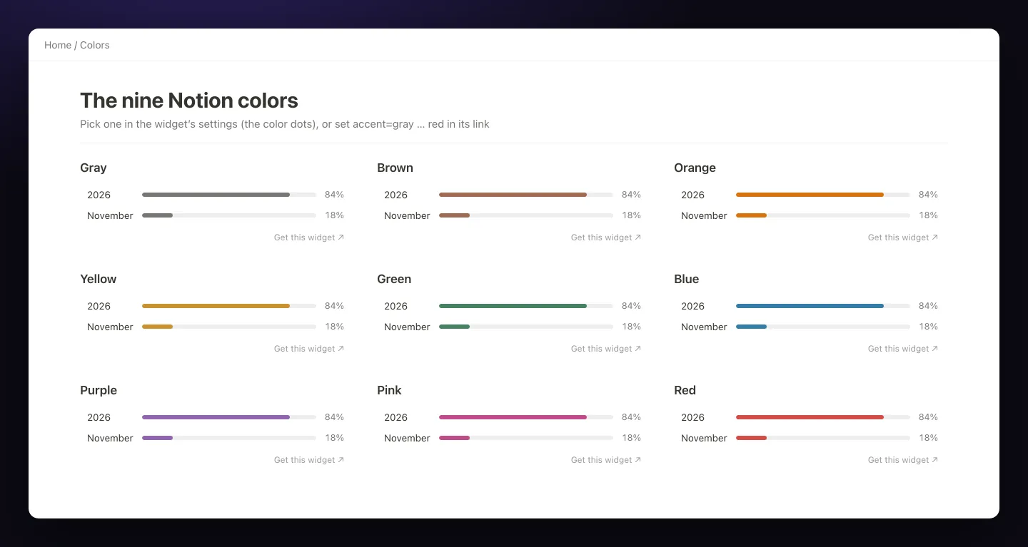
The widgets are free with a sign-in, and the free plan keeps up to 3 saved widgets. IVGraph Plus, $5 a month, unlocks every look and setting, such as the flip clock’s Retro look and the habit tracker’s shades, and removes the small “Get this widget” link. Nothing connects to your workspace. How to embed them, and how to fix an embed that won’t load, is in our guide to embedding in Notion.
Match a widget to your page. Pick a widget, set its accent to one of Notion’s colors, copy the link and paste it with /embed. It follows light and dark mode on its own.
Pick a widget15. Save your style as a template page
Notion has no default style for new pages, so the settings above apply page by page. Make one page with your cover, icon, font, width and a callout, and duplicate it whenever you need a new one. Inside a database, the same page can be a database template, so every new entry starts styled.
Check it in dark mode and on your phone
Switch the theme in Settings → Preferences → Appearance, or press Cmd/Ctrl + Shift + L. Notion’s own colors have dark versions and switch by themselves. What doesn’t switch is anything with its own background: covers and images with white areas, screenshots, and embeds that always draw a white box. Those glare in dark mode.

Then open the page in the Notion app on your phone. Columns stack, so the left column comes first and the right one moves under it; put the most important part on the left. Text size and page width can’t be changed on mobile, and a three-column layout becomes one long scroll, so check that the order still makes sense.
What Notion won’t let you change
- No default style. Full width, the font and Small text are set per page; Notion lists a default style as a common request.
- Three fonts only. Default, Serif and Mono, no uploads. The “aesthetic fonts” from online generators are Unicode look-alike symbols: screen readers may read them as math symbols or skip them, and search can’t find the words.
- No page background color. Use a cover for color at the top and callouts for colored areas.
- No text alignment. Use the columns trick from tip 6.
- No custom CSS. Browser extensions and desktop mods can restyle Notion in your own browser, but nobody else sees it, and an update can break it.
- Nine colors. The palette is fixed. Covers, images and icons are where other colors come in.
Aesthetic templates: shortcut or trap?
Notion’s template gallery and marketplaces are full of aesthetic setups, and Pinterest boards and the setups people share on Reddit and YouTube show many more. For inspiration, save screenshots of pages you like and note what makes them work: usually the palette, the font and the spacing, not the number of sections. As a starting point, templates come with three catches:
- The look is built around someone else’s life. Sections you don’t use stay empty and make the page look unfinished. Keep the style, delete the sections.
- The widgets are someone else’s. Embedded clocks, countdowns and trackers carry the template maker’s settings. Replace them with your own links.
- Heavy pages get slow. Several GIFs, large covers and many embeds on one page make it slow to open, especially on a phone.
Applying the fifteen changes above to your own pages takes about an hour, and the result fits what you actually do. For a home page that’s both useful and good-looking, combine this guide with how to build a Notion dashboard.
FAQ
Can you change the font in Notion?
Partly. Each page can use one of three fonts: Default, Serif or Mono, set in ••• → Appearance & layout, where you can also turn on Small text. You can’t upload your own font. The “fancy fonts” from text generators are Unicode symbols, which screen readers and search can’t read properly.
Can you change the background color of a Notion page?
Not of the whole page. You can color text and blocks: type /red or any other color name, or use the A menu after selecting text. For a colored area, put blocks inside a callout and give it a background color, and use a cover for color at the top of the page.
Can I make full width the default for all pages?
No. Notion has no default style for new pages, so full width, the font and Small text are set page by page in ••• → Appearance & layout. A template page with your settings, duplicated for each new page, is the closest workaround.
Can I use custom CSS or themes in Notion?
Not inside Notion. Browser extensions and desktop mods can restyle Notion on your own computer, but nobody else sees the change, and a Notion update can break it. Everything in this guide uses Notion’s own settings, so it looks the same for everyone.
Do widgets work with Notion’s dark mode?
IVGraph widgets do: with no theme set, they have a transparent background and follow the light or dark mode of the device, as Notion does. Pick Light or Dark only if your Notion theme differs from the device. Their nine accent colors are Notion’s own text colors.